In EstateVal, the difference between a portfolio that’s been evaluated and one that hasn’t is everything — the software exists to tell you what the securities in the portfolio are worth, quickly and accurately. Before the evaluation, you have CUSIPs and Shares. After, you have a report that lets you file Form 706 Schedule B worry-free.
But the program itself doesn’t change all that much after you run an evaluation. In fact, if you load a portfolio, there’s no way to tell from the main screen if it’s already been evaluated. That’s crazy!
So in EstateVal 8.2, we’ve added “evaluation status icons.” These are small images that appear next to each lot in the grid, telling you the exact state of that security for both the Date of Death and Alternate Date. It makes the work you’ve done instantly identifiable, but also allows you to quickly see which securities might have a problem.

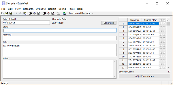
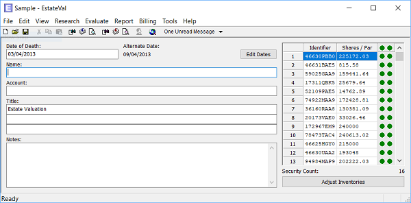
To turn on the icons, go to Tools > Options… > Standard and set “Show Evaluation Status” to “Yes.” Two columns will appear on the right side of the gird, the first representing the Date of Death evaluation status for the current Date of Death, and the second representing the Alternate Date.

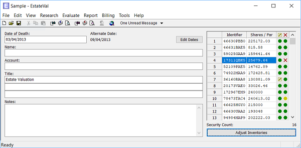
An empty circle means the security hasn’t been evaluated — EstateVal has not attempted to get pricing. A green ball means the security has been successfully priced and all is well. A yellow ball means the security has been evaluated and a price was retrieved, but that price was not for the exact evaluation date, and might merit more research — it could be because the security is thinly-traded or stopped pricing. A yellow pen in a square indicates a user-defined price, meaning that you have manually edited in a price. A red X shows a security that EstateVal could not price, because of an unknown CUSIP or unavailable pricing or some other issue. Red Xs will show up on reports as “N/A” and you should definitely check them out, to find out what the issue is!

At the top of each column, in the header of the grid, is a “summary icon” that will show the status of every lot for that report in the portfolio. If everything is priced properly, it will be a green ball. If everything is successfully priced, but one single price does not come from the valuation date, it will be a yellow ball, to indicate at a glance that somewhere in the portfolio, there may be a problem. If there’s a red X, be sure to scroll through all your lots, to find where the trouble is — once it’s corrected, the summary icon will adjust and you can know that your reports will be exactly as you intended.
Likewise, if you have adjusted inventories for the Alternate Date, the evaluation status icon for that lot in the second column will behave the same way was the summary icons in the header: if there’s one inventory item with a user-defined price, for example, the icon will show the pen-within-a-square, to let you know that that’s the lot that’s been manually changed. If you run an Alternate Date report, and then add an adjusted inventory item, the icon will switch to the grey circle, to let you know that that lot still needs data.
Evaluation status icons are a fast and convenient way to find out the state of your portfolio at a glance. It’s colorful, automatic, and a heck of a lot easier than printing out and looking through the report!